Showing posts with label Illustration. Show all posts
Showing posts with label Illustration. Show all posts
4/24/13
Putting Birds in Circles
Quick vector illustration of a pair of Ribbon-tailed Astrapias, a near-threatened bird of paradise. Approx. print dimensions: 14" x 14"
3/12/13
Presenting: UChicago Thinkers' Toys
Hewn from solid maple by patriotic American robots, this set of eight illustrated woodblocks feature "Places and spaces [old and new] where students play with ideas."
Sets are given as a thank-you to donors who give $50 or more to the University of Chicago Magazine, which I assure you is a worthwhile cause.
Make a gift today and receive your set!
Art direction: Guido Mendez
Print collateral design: Nicole Melton
Copy: Mary Ruth Yoe
Magazine ad & mailing photography: Nathan Keay
Vendor: Proform Technologies
Illustration: Tom Tian
Photography featured in this post: Tom Tian
3/8/13
Environmental U-Turn
A quick, very straightforward illustrated save-the-date postcard for Healthy Water Solutions, an affiliate of the Illinois chapter of the Sierra Club. The corresponding event focuses on the use of hydro-separation and other engineering initiatives to reverse the environmental degradation of the Chicago River and reinvigorate an economically moribund sector of the city. The basic illustration and layout was in turn adapted onto a mail piece and signs.
1/22/13
Chicago Is ...
Drawn in Illustrator CS5
... the Wrigley Building, at least back when Sinatra sang about it. Completed this one in about an hour and a half.
12/28/12
The Produce of Leisure
Drawn in Illustrator CS5
Drawn in Illustrator CS5
It's been a slow week all around, which means finally having some quality time for side projects. These "quick" portraits of Audrey Hepburn and Ernest Hemingway, based on photos by the legendary Yousuf Karsh, were drawn dot-by-dot in Illustrator CS5 over a couple of hours.
12/24/12
CHRISTMAS SAX
Graphite on nondescript bond paper. Digital colors added in Photoshop CS6.
Spotted on this morning's inbound Metra Electric: A festively dressed character; saxophone added ex post facto. Merry Christmas, everyone!
Also available in wallpaper form, sans holiday greetings.
2880 x 1800 (for Macbook Pro w/ Retina display)
2560 x 1440 (for 27" iMacs and newer Thunderbolt displays)
1900 x 1200 (for 21" iMacs and older Thunderbolt displays)
1536 x 2048 (for iPads w/ Retina displays)
1024 x 768 (for older iPads)
7/22/12
Something Saccharine
India ink and marker on bristol board. Colors added in Photoshop CS5.
A quick (~3.5 hr.) multi-panel comic. The idea came to me when I was out by Botany Pond this evening. My one quibble has to do with pacing; I feel like the strip could've used a frame between panels two and three so that panels six, seven, and eight could be on the same row, which I think could work better. Animated .gif of the process available below:
4/16/12
And God Said It Was...
Drawn in Photoshop CS5
...an illustration for this month's issue of The Hypocrite Reader, this time for an article about transcendence and re-creation in Genesis. I thought that a mostly typographic, calligraphic solution was most fitting given the importance of language in creation and connotations of divine grace. The lettering was initially hand-drawn, then scanned and digitally inked.
1/22/12
Walnut v. India Ink
Walnut ink (left) and India ink (right) on bristol board; line work done using Hunt 107 nib; wash fills using nondescript #5 round sable brush; open in new window/tab for high-res. version
Molly was kind enough to give me a bottle of her hand-made walnut ink to test. Having worked with nothing but good ol' India ink and watercolor lampblack, I was excited by the prospect of trying something new.
This particular blend of walnut ink reminded me of coffee at first glance, and smelled rather strongly of alcohol, which I gather was added to prevent molding. Overall, said ink was visibly less viscous (it lacks additional binding agents) and nowhere near as light-fast, which made it less useful for hatching and fine line work. Fortunately, I had no trouble seeing what I was inking on the light table, and was on the whole pleasantly surprised by how easy it was to handle. It flowed effortlessly when used with both pen and brush, and was just as easy to clean.
Differences in opacity aside, the walnut ink I used also demonstrated some other curious characteristics. For instance, upon closer examination I noticed that it tended to pool at the edges of strokes (see detailed inset), leaving the center palpably lighter, though the effect was hardly unpleasant. Together with the ink's natural sepia tone and transparency, it lent the drawing a rather soft, low-contrast, somewhat nostalgic feel. When used in a wash, it bled less when applied to a pre-wetted surface, and barely needed diluting to achieve relatively high values and lighter mid-tones. Shadows are another story, and I suspect a more concentrated admixture will be required.
Alas, I won't be able to speak to its archival value for quite some time, though I'll venture to say that it's just as durable as India ink if properly stored. In the last analysis, I still prefer India ink for its opacity, contrast, and versatility, but odds are you'll see select illustrations rendered in walnut ink in the future.
1/16/12
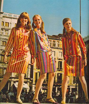
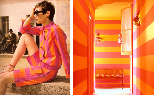
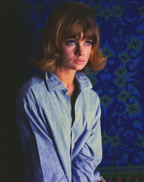
The Way We Dressed, Circa 1965
Graphite on newsprint; digital colors
Come to think of it, this could double as an entry for how hip young types dress nowadays. Reference photos below:
1/15/12
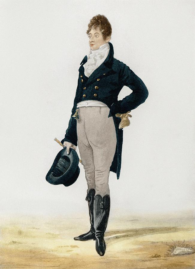
The Way We Dressed, Circa 1805
Graphite on newsprint; digital colors
The hottest looks of 1805. Check out those tasseled boots! (Original image below)
1/14/12
Lite of the Mind
India ink on bristol board; digital colors
An illustrated feature for my alma mater's alumni publication, The University of Chicago Magazine, which was recently redesigned by, wait for it, Pentagram partners Michael Beirut and Luke Hayman.
Fun fact: The illustration is actually a composite of five separate drawings. I worked out the overall layout on a single sheet of paper before separating and scaling the individual elements, as my scanner can only accommodate 8.5" x 11" stock.
1/12/12
Aboard the USS Pickle Jar
India ink on bristol board; digital colors; click for hi-res. version
A sneak peek at this month's issue of the Hypocrite Reader, the theme of which is "Home and Heartache." The corresponding article discusses the uncertainties that attend modern cottage industry--its author, a twenty-something recent graduate, sells jars of home-made pickles (among other craft goods) out of her apartment.
1/7/12
Ode to Portland(ia)
India ink on bristol board; digital colors in Photoshop CS5 and Illustrator CS5
Let's retire to Portland and put birds on things. Seriously, though, Portland is probably the most pleasant, well-laid-out city I've ever visited.
Here's the illustration as a 1920 x 1080 px wallpaper:
1/2/12
Year of the Dragon
Drawn in Illustrator CS5; lightly post-processed in Photoshop CS5
The actual Year of the Dragon begins on the twenty third of January, so consider this an anticipation of things to come.
Update: Now available as a wallpaper at the following sizes (right/ctrl-click and select "view in new tab/window" for full size):
1024 x 768
1920 x 1080
12/25/11
Fourteen Days, Fourteen Santas
Every Christmas, I lurch wearily to my drawing board with the help of Plumtree's Wintertime Blend Nerve Tonic (a tasty blend of 100-proof whiskey, mint extract, and cocaine-infused seltzer water), and drag a scribble-stick across paper in the hope of staving off depression for another week. In previous years this exercise in illustrative masochism was usually compressed into a few days of manic back-to-back storyboarding, inking, and coloring, interspersed with spilled ink and muttered profanities.
This year, I decided to distribute the madness across two weeks for reasons that now elude me. I'd like to fancy that my choice was informed by practical considerations or out of a desire to cultivate discipline, but, as is the case with so many personal projects, it probably came down to something almost wholly arbitrary and/or compulsive. Despite the lack of a unifying theme beyond Father Christmas himself, I actually did invest a good chunk of thought into each entry's concept and execution. Some entires were inspired by something I saw/heard that particular day. For instance, Saturday's illustration (013) materialized after I listened to an excerpt from David Sedaris's SantaLand Diaries on This American Life, and Tuesday's (009) popped into my head after killing some time on the Vintage Ad Browser.
001: Sinterklaas & Krampus
I left out a depiction of Zwarte Piet for obvious reasons.
002: He's Made of Elves!
Straightforward gag; references the series of Calvin & Hobbes strips where Calvin's father provides him with misleading characterizations of how things like ATMs and garage doors work.
003: Long-Haul Trucker Santa
I remember being worried about how this one would be received. It's not really a reference to anything in particular (though "Ice Road Truckers" did come to mind after I'd finished it).
004: 8-Bit Santa
This one started out as a smaller pixel portrait of Father Christmas, which I decided was boring. The illustration was built pixel by pixel, and took about five episodes of "How I Met Your Mother" to finish.
005: Dalek Claus
I saw this photo of a Christmas-themed Dalek on Gizmodo, which informed this particular illustration. I guess the whole "Christmas Dalek" thing felt flat if it wasn't ex-ter-mina-ting anything.
006: Mr. & Mrs. Claus, [Late-]80s Pop Sensation
Who doesn't love glitter pop? "David Bowie Claus" was the germinating idea, but I really wanted something with Hammer pants, hence the result shown here.
007: The Claus Group -- Annual Report 2011
This is the only entirely digital illustration of the entire batch. Everything else is hand-inked. I'd planned on doing a spoof graphic identity guide for a similar yuletide corporation last year, but didn't get around to executing it.
008: North Korean Propaganda Santa
Kim Jong-il might be dead, but ridiculous DPRK propaganda will live on!
009: The Three S's of Christmas
I wanted to do a Mad Men-esque Santa, but thought it'd look stale and unimaginative. I decided to do a faux-period piece after wasting time on the Vintage Ad Browser.
010: Basil Wolverton Claus
Basil Wolverton was a longtime cartoonist for MAD and a master of grotesque appeal (also of really trippy/disturbing Bible illustrations, the Book of Revelations in particular). This is less homage as an excuse for me to try something stylistically different.011: Exit, Eaten by a Bear
This one was really, really last-minute. I must've finished it at eleven o' clock. The original is only 1.5" x 1.5".
012: 2011: A Santa-Themed Odyssey
My original idea was to draw Santa visiting the Int'l Space Station, but it felt a bit less awesome than a Kubrick reference. The background is a screen grab from the film, hastily photoshopped.
013: Mall Santa Fiasco
Thank you, Mr. Sedaris, for working as a mall elf so I can have material for this illustration, the penultimate one in the series.
014: Christmas Day at the Jade Dragon
This one speaks for itself.
11/15/11
Elvis Impersonators and...Weimar Communists?
It's the fifteenth, which means a new issue of the Hypocrite Reader is due. This month's issue (topic: "Occupations") might be delayed owing to the early morning evacuation of Zuccotti Park, but keep your eyes peeled.
India ink on bristol board; digital post-processing
The above illustration accompanies an article discussing the role of shame in cultivating solidarity among activists, the first half of which examined the tensions between affectuous, part-time Occupy neophytes and more experienced, committed activists. Said article includes an anecdotal account of an Elvis impersonator posing for the cameras at Occupy New Vegas, the author doubtful of his reliability as a participant. I ended up using a simple big-small contrast to illustrate the displacement of other demonstrators.
India ink on bristol board; digital post-processing
"Weimar communists hawking newspapers on a street corner" was my (very concise) brief for this illustration. I'd thought about adding building or lamp post in the background, but decided against it because the inclusion of potentially confusing details outweighed the benefit of additional context.
10/28/11
Mr. President
Drawn in Illustrator CS5; original size: A1 (594mm x 841mm)
A strictly unofficial vector poster of Barack.
10/14/11
Reconstruction
It's the fifteenth, which means it's time for another issue of The Hypocrite Reader. This month's theme is "Reconstruction."
Ink & wash on bristol board; digital colors
I had a thumbnail of this idea on paper about five minutes into concepting, but set it aside for some stupid reason, only to return to it when the more complex idea fell apart. I'm pleased with the way this one turned out in the end. The original article was about a letter addressed to one's future amnesiac self.
Ink & wash on bristol board; digital colors
The same can't be said for this one, which corresponds to an article that discussed Perestroika's superficiality. I had the idea worked out fromt the get-go, but botched the execution, partly for want of time. In hindsight, I should probably have drawn this in Illustrator instead.
Subscribe to:
Posts (Atom)


