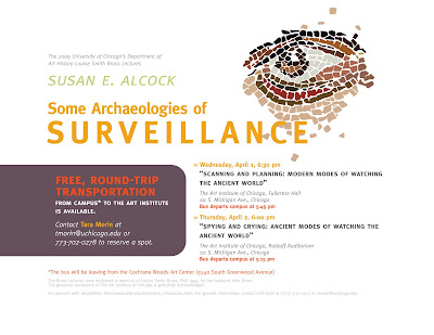
Designed in Adobe Illustrator CS3; font: Meta (an excellent "corporate" type family, but also commensurately expensive (~$400))
This has been a curious spring break, considering that I've spent four of the last five days on campus. Anyhow, here's some more recent publicity work for the Division of the Humanities, this time for a specific feature (free transportation) of a lecture. I was asked to do this out of the proverbial blue, and was provided another flier to use as a guide. The reference poster featured some curious color choices (including a rather garish green), two fonts (Didot for the title and some nondescript sans-serif typeface for the body) and used a regrettably low-resolution, poorly edited photograph of a mosaic. Overall, it was a safe, conservative design.
As you can see, I took a few liberties. I substituted Meta for the serif-sans-serif combination, and applied a consistent system of type treatment that I thought reflected the hierarchy suggested by the copy. Otherwise, I traced out a portion of the mosaic in vectors and tweaked the existing color scheme, adding a bright yet semi-subdued orange to highlight everything related to transportation.

The final task involved scaling everything down to fit on an 8.5" x 11" sheet of paper. This will be disseminated to students in-class as a mini-flier.

No comments:
Post a Comment