Showing posts with label Division of the Humanities. Show all posts

3/30/09

Freedom to Typeset


Designed in Adobe Illustrator CS3; font: Helvetica Neue

More work for the Humanities Division. A flier with this much copy should probably be printed on something other than 11" x 17", but I think that it turned out alright considering the spacial constraints.

The real challenge, though, was to get the event title to display properly against the background image. After a bit of tinkering, I settled on an x-band pattern to wash out the otherwise dissonant cross-hatching of the original woodcut, a choice that I also think dovetailed neatly with the lecture's multidisciplinary character.


Outlined view showing guides, margins, etc. This took about three hours to make from conception to final product.

3/27/09

Design on the Fly


Designed in Adobe Illustrator CS3; font: Meta (an excellent "corporate" type family, but also commensurately expensive (~$400))

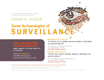
This has been a curious spring break, considering that I've spent four of the last five days on campus. Anyhow, here's some more recent publicity work for the Division of the Humanities, this time for a specific feature (free transportation) of a lecture. I was asked to do this out of the proverbial blue, and was provided another flier to use as a guide. The reference poster featured some curious color choices (including a rather garish green), two fonts (Didot for the title and some nondescript sans-serif typeface for the body) and used a regrettably low-resolution, poorly edited photograph of a mosaic. Overall, it was a safe, conservative design.

As you can see, I took a few liberties. I substituted Meta for the serif-sans-serif combination, and applied a consistent system of type treatment that I thought reflected the hierarchy suggested by the copy. Otherwise, I traced out a portion of the mosaic in vectors and tweaked the existing color scheme, adding a bright yet semi-subdued orange to highlight everything related to transportation.


The final task involved scaling everything down to fit on an 8.5" x 11" sheet of paper. This will be disseminated to students in-class as a mini-flier.

A [Verbose] Campaign in Progress


Designed in Adobe Illustrator CS3; font: Anivers family (a very versatile, high-quality, and economic typeface; highly recommended)

Publicity materials for the Division of the Humanities' upcoming Spring Lecture Series. My employer was generous enough to allow me full control over the campaign's style, though I had no say over the copy, which was typically verbose. There was no predetermined motif; I interpreted the occasion as a part of a continuous dialogue, wherefore I settled on a more orthogonal variation of a Mobius strip. In hindsight, it's also a consciously concise counterpart to the weighty amount of text. Its parsimony also simplified any potential vignetting and formal direction.

The principal challenge came down to typesetting all that copy across various formats, including an unforgiving postcard with very, very little space.


Much cranium-scratching went into formatting this postcard, since I couldn't modify the copy itself to fit the space allotted. Still, I think that the typesetting managed to separate and distinguish each section in an intelligible fashion--achieved through a consistent hierarchy/system of weights, colors, leading, and paragraph spacing.


Transferring all that copy onto 11" x 17" presented its own challenges, mostly on account of the addition of four more lectures to the series. My original plan involved laying out the copy in rows with the date on the left and specific times on the right. The unexpected addition of four other lectures made that scheme untenable. Dividing the copy into three columns solved the problem. Though I preserved the basic hierarchy established in the postcard, my employer asked me to assign more prominence to the individual lecture titles instead of their respective series.


And finally, the 24" x 36" iteration of the flier (scaled down for web viewing), which was much, much easier to typeset.