India ink and graphite on newsprint;
compositing, layout and post-processing in Illustrator and Photoshop;
full/actual paper size: A0 (~0.8m x 1.1m)
Today's nostalgia for a more...civilized era of air travel is easy to understand. Who, after all, can resist the thought of sleek Eero Saarinen terminals, equally streamlined airplanes, and crisply attired captains and stewardesses (not to mention other amenities like free in-flight meals) in an age when air travel has been debased to the level of a mostly thankless, pedestrian, and at times intrusive ordeal? Sure, airfare was more expensive before the fragmentation and deregulation of the airline industry, but I think one could be forgiven for romanticizing a more tasteful albeit expensive bygone.
On a related note, I'd like to take a moment to address what Steven Heller, whom Gawker termed "
some expert" (fat lot they know about design!), wrote for
Print Mag's
blog, where he pointed out some cursory similarities between the claustrophobic layouts of modern jetliners and slave ships. Now, before you sentimental lefty PC-types reach for your pitchforks, allow me to say that Mr. Heller probably intended the post to be more lighthearted (it's an idle musing, after all, and not a twenty-page term paper) than as perceived.
But is there some kernel of truth behind his casual observation? I wouldn't call air travel
degrading (though like I said before it's a far cry from what it used to be), but the notion of maximizing carrying capacity and spacial economy in both instances necessarily comes at the passenger's expense. That is, in both instances a similar (though hardly identical) comprehension of the passenger as cargo obtains.
The principal difference here is a function of motivation--by which I mean contempt for the persons transported. Rationally-minded airline planners might not be disposed to view their customers as people (that's the job of the marketing & PR department), but that said they also don't think of them as subhuman beasts. Whatever indignities airlines inflict on their passengers is only ancillary, whereas the depredations slaves-in-transit endured are the consequence of deliberate, calculated oppression, insult, and inhumanity.
The other big difference is pretty obvious: Unlike slaves, airline passengers usually have ready recourse to other modes of transportation. With sufficient funds, they can purchase additional comfort, or, if the distance is not too far and time too urgent a consideration, travel at a more leisurely pace by car or train. Though protracted air travel does wear on the nerves, the longest intercontinental flight also comes nowhere near the duration of an eighteenth-century trans-Atlantic death voyage.
So what about the formal similarities? Well, formal similarities are by definition superficial, and here I think the resemblance is not entirely unwarranted. Apart from diverging choice of icons, I will admit that the two diagrams
look alike. But design's significance is, as Mr. Heller knows, informed by context, so the only crime he committed was making a bad airline joke.


 Designed in Adobe Illustrator CS3; laid-out in InDesign CS3; font: Helvetica (portrait) and Gotham (headline & body)
 Designed in Adobe Illustrator CS3; Font: Helvetica Neue; Dimensions: 7" x 9" x 1"
 Front Cover
 Spine
Spine
 Designed in Adobe Illustrator CS3; Fonts: Gotham, Nevis, and Annivers
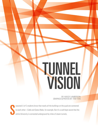 Designed in Adobe Illustrator CS3 and InDesign CS3; Font: Univers
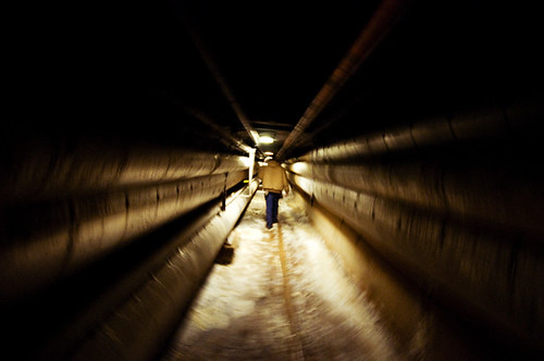 Nikon D90; 10-24mm f/3.5-4.5; ISO 1600; WB: Auto (A3); minor adjustments in Photoshop CS3; un-cropped version available here
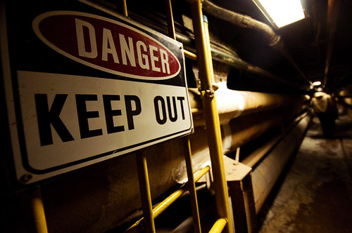 Nikon D90; 10-24mm f/3.5-4.5; ISO 1600; WB: Auto (A3); minor adjustments in Photoshop CS3; un-cropped version available here
 Nikon D90; 10-24mm f/3.5-4.5; ISO 1600; WB: Auto (A3); minor adjustments in Photoshop CS3; un-cropped version available here
 Grey City: Issue 5
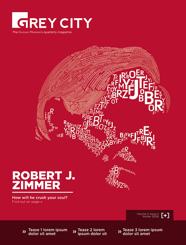
 Photo by Camille Van Horne; font: Helvetica Neue
 Designed in Adobe Illustrator CS3; laid out and typeset in Adobe InDesign CS3; font: Univers
  Photo by Camille Van Horne; fonts: Grafinc Extra Black (with slightly modified letterform "C") and Rockwell
 Designed in Adobe Illustrator CS3; laid-out and typeset in Adobe InDesign CS3; font: Quicksand
 Not bad for a night's work.
 Camera: Nikon FE; lens: Nikon AF Nikkor 50mm f/1.8 D; film: Ilford Delta 400 B&W; exposure: 1/125 at f/22; subject is flood-lit using high-power strobes
 Designed in Adobe Illustrator CS3; font: Gotham;