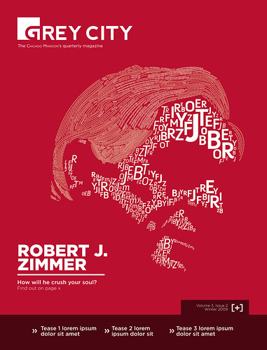
 Designed in Adobe Illustrator CS3; Fonts: Gotham, Nevis, and Annivers
Notwithstanding many and various reservations, I must admit that I will miss working for the Maroon and Grey City, its quarterly magazine. My term as managing editor will end next Thursday, and, quite frankly, I'm not looking forward to the
anomie that will no doubt follow. I've been mulling over the prospect of drawing editorial cartoons next quarter, but we'll see.
In the meantime, I'm quite happy with how the cover of this quarter's Grey City turned out--illustrated magazine covers are a rarity nowadays, at least outside the confines of art publications. The general design philosophy elsewhere seems to be one of total imaginative surrender (read: "let's slap a ton of copy onto some photo and call it a day").
Anyhow, the the above illustration was assembled by hand--the weight and physical of the characters describe values from a reference photograph, which I posterized in Photoshop before reproducing it in Illustrtor. The entire process took something in the order of four to five hours, I think.
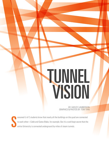 Designed in Adobe Illustrator CS3 and InDesign CS3; Font: Univers
The original lead graphic for the above article was less-than-satisfactory. It involved a vector profile of Rockefeller Chapel that led to some pipes representing the tunnels, which in turn led to the modified letterform "S" of the drop cap. I wasn't enthusiastic about the way the image locked with the copy, and felt that it failed to capture the headline. What you see above is a last-minute change, which, in my estimation, works much, much better.
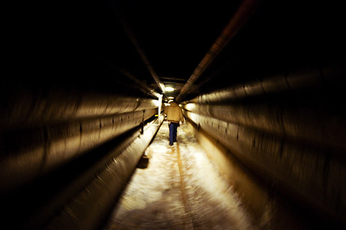 Nikon D90; 10-24mm f/3.5-4.5; ISO 1600; WB: Auto (A3); minor adjustments in Photoshop CS3
;
un-cropped version available hereI also took some photos of the steam tunnels for the article of record. They're less remarkable, but shooting in the field is always entertaining.
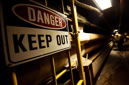 Nikon D90; 10-24mm f/3.5-4.5; ISO 1600; WB: Auto (A3); minor adjustments in Photoshop CS3
;
un-cropped version available here Nikon D90; 10-24mm f/3.5-4.5; ISO 1600; WB: Auto (A3); minor adjustments in Photoshop CS3
;
un-cropped version available here

 Designed in Adobe Illustrator CS3; laid-out in InDesign CS3; font: Helvetica (portrait) and Gotham (headline & body)


