Showing posts with label Hand Illustration. Show all posts

1/22/12

Walnut v. India Ink


Walnut ink (left) and India ink (right) on bristol board; line work done using Hunt 107 nib; wash fills using nondescript #5 round sable brush; open in new window/tab for high-res. version

Molly was kind enough to give me a bottle of her hand-made walnut ink to test. Having worked with nothing but good ol' India ink and watercolor lampblack, I was excited by the prospect of trying something new.

This particular blend of walnut ink reminded me of coffee at first glance, and smelled rather strongly of alcohol, which I gather was added to prevent molding. Overall, said ink was visibly less viscous (it lacks additional binding agents) and nowhere near as light-fast, which made it less useful for hatching and fine line work. Fortunately, I had no trouble seeing what I was inking on the light table, and was on the whole pleasantly surprised by how easy it was to handle. It flowed effortlessly when used with both pen and brush, and was just as easy to clean.

Differences in opacity aside, the walnut ink I used also demonstrated some other curious characteristics. For instance, upon closer examination I noticed that it tended to pool at the edges of strokes (see detailed inset), leaving the center palpably lighter, though the effect was hardly unpleasant. Together with the ink's natural sepia tone and transparency, it lent the drawing a rather soft, low-contrast, somewhat nostalgic feel. When used in a wash, it bled less when applied to a pre-wetted surface, and barely needed diluting to achieve relatively high values and lighter mid-tones. Shadows are another story, and I suspect a more concentrated admixture will be required.

Alas, I won't be able to speak to its archival value for quite some time, though I'll venture to say that it's just as durable as India ink if properly stored. In the last analysis, I still prefer India ink for its opacity, contrast, and versatility, but odds are you'll see select illustrations rendered in walnut ink in the future.

1/16/12

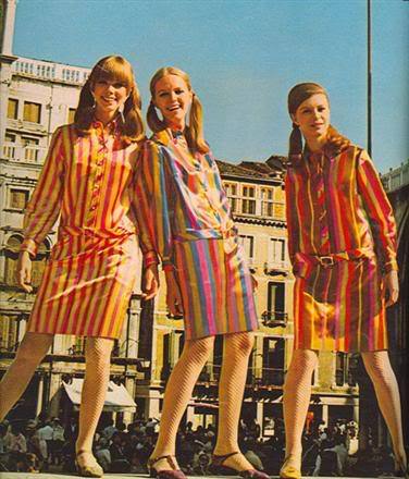
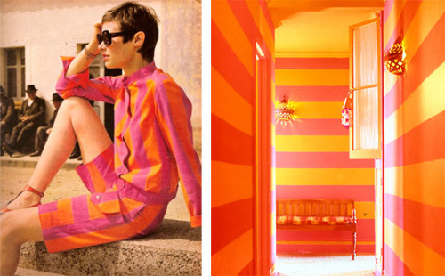
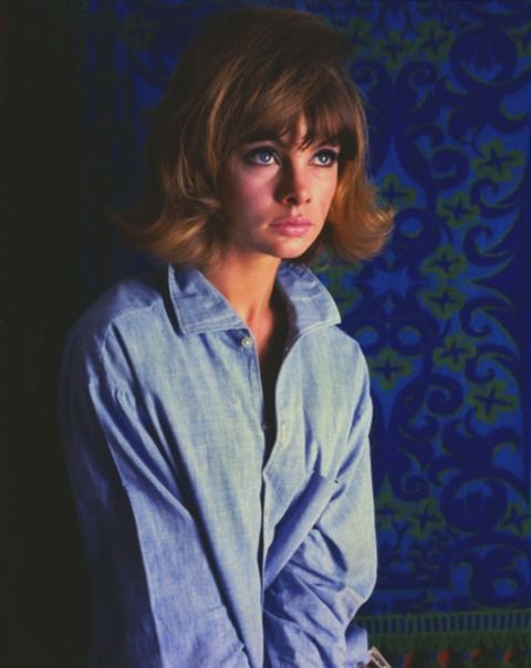
The Way We Dressed, Circa 1965


Graphite on newsprint; digital colors

Come to think of it, this could double as an entry for how hip young types dress nowadays. Reference photos below:


1/15/12

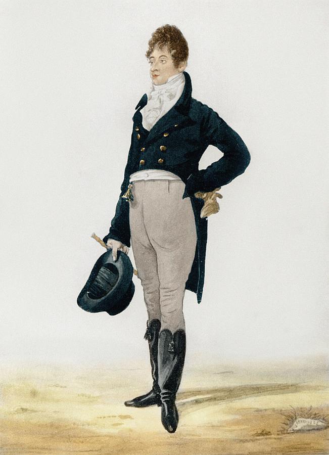
The Way We Dressed, Circa 1805


Graphite on newsprint; digital colors

The hottest looks of 1805. Check out those tasseled boots! (Original image below)


1/14/12

Lite of the Mind


India ink on bristol board; digital colors

An illustrated feature for my alma mater's alumni publication, The University of Chicago Magazine, which was recently redesigned by, wait for it, Pentagram partners Michael Beirut and Luke Hayman.

Fun fact: The illustration is actually a composite of five separate drawings. I worked out the overall layout on a single sheet of paper before separating and scaling the individual elements, as my scanner can only accommodate 8.5" x 11" stock.

1/12/12

Aboard the USS Pickle Jar


India ink on bristol board; digital colors; click for hi-res. version

A sneak peek at this month's issue of the Hypocrite Reader, the theme of which is "Home and Heartache." The corresponding article discusses the uncertainties that attend modern cottage industry--its author, a twenty-something recent graduate, sells jars of home-made pickles (among other craft goods) out of her apartment.

1/7/12

Ode to Portland(ia)


India ink on bristol board; digital colors in Photoshop CS5 and Illustrator CS5

Let's retire to Portland and put birds on things. Seriously, though, Portland is probably the most pleasant, well-laid-out city I've ever visited.

Here's the illustration as a 1920 x 1080 px wallpaper:


1/4/12

The Way We Dressed


Graphite on newsprint

Chris Salata, a friend of mine who's working as a photojournalist down in Palm Beach, found a trove of 5" x 7" glass plate negatives belonging to WPA muralist Alexander Rummler at an antique show. He was kind enough to provide me a scan (see below) for a quick caricature.


12/25/11

Fourteen Days, Fourteen Santas

Every Christmas, I lurch wearily to my drawing board with the help of Plumtree's Wintertime Blend Nerve Tonic (a tasty blend of 100-proof whiskey, mint extract, and cocaine-infused seltzer water), and drag a scribble-stick across paper in the hope of staving off depression for another week. In previous years this exercise in illustrative masochism was usually compressed into a few days of manic back-to-back storyboarding, inking, and coloring, interspersed with spilled ink and muttered profanities.

This year, I decided to distribute the madness across two weeks for reasons that now elude me. I'd like to fancy that my choice was informed by practical considerations or out of a desire to cultivate discipline, but, as is the case with so many personal projects, it probably came down to something almost wholly arbitrary and/or compulsive. Despite the lack of a unifying theme beyond Father Christmas himself, I actually did invest a good chunk of thought into each entry's concept and execution. Some entires were inspired by something I saw/heard that particular day. For instance, Saturday's illustration (013) materialized after I listened to an excerpt from David Sedaris's SantaLand Diaries on This American Life, and Tuesday's (009) popped into my head after killing some time on the Vintage Ad Browser.

Anyhow, you probably didn't come here to read about me pulling ideas out of my rear the ether. The collected illustrations are available below for your perusing pleasure.


001: Sinterklaas & Krampus
I left out a depiction of Zwarte Piet for obvious reasons.


002: He's Made of Elves!
Straightforward gag; references the series of Calvin & Hobbes strips where Calvin's father provides him with misleading characterizations of how things like ATMs and garage doors work.


003: Long-Haul Trucker Santa
I remember being worried about how this one would be received. It's not really a reference to anything in particular (though "Ice Road Truckers" did come to mind after I'd finished it).


004: 8-Bit Santa
This one started out as a smaller pixel portrait of Father Christmas, which I decided was boring. The illustration was built pixel by pixel, and took about five episodes of "How I Met Your Mother" to finish.


005: Dalek Claus
I saw this photo of a Christmas-themed Dalek on Gizmodo, which informed this particular illustration. I guess the whole "Christmas Dalek" thing felt flat if it wasn't ex-ter-mina-ting anything.


006: Mr. & Mrs. Claus, [Late-]80s Pop Sensation
Who doesn't love glitter pop? "David Bowie Claus" was the germinating idea, but I really wanted something with Hammer pants, hence the result shown here.


007: The Claus Group -- Annual Report 2011
This is the only entirely digital illustration of the entire batch. Everything else is hand-inked. I'd planned on doing a spoof graphic identity guide for a similar yuletide corporation last year, but didn't get around to executing it.


008: North Korean Propaganda Santa
Kim Jong-il might be dead, but ridiculous DPRK propaganda will live on!


009: The Three S's of Christmas
I wanted to do a Mad Men-esque Santa, but thought it'd look stale and unimaginative. I decided to do a faux-period piece after wasting time on the Vintage Ad Browser.


010: Basil Wolverton Claus
Basil Wolverton was a longtime cartoonist for MAD and a master of grotesque appeal (also of really trippy/disturbing Bible illustrations, the Book of Revelations in particular). This is less homage as an excuse for me to try something stylistically different.


011: Exit, Eaten by a Bear
This one was really, really last-minute. I must've finished it at eleven o' clock. The original is only 1.5" x 1.5".


012: 2011: A Santa-Themed Odyssey
My original idea was to draw Santa visiting the Int'l Space Station, but it felt a bit less awesome than a Kubrick reference. The background is a screen grab from the film, hastily photoshopped.


013: Mall Santa Fiasco
Thank you, Mr. Sedaris, for working as a mall elf so I can have material for this illustration, the penultimate one in the series.


014: Christmas Day at the Jade Dragon
This one speaks for itself.

11/15/11

Elvis Impersonators and...Weimar Communists?

It's the fifteenth, which means a new issue of the Hypocrite Reader is due. This month's issue (topic: "Occupations") might be delayed owing to the early morning evacuation of Zuccotti Park, but keep your eyes peeled.


India ink on bristol board; digital post-processing

The above illustration accompanies an article discussing the role of shame in cultivating solidarity among activists, the first half of which examined the tensions between affectuous, part-time Occupy neophytes and more experienced, committed activists. Said article includes an anecdotal account of an Elvis impersonator posing for the cameras at Occupy New Vegas, the author doubtful of his reliability as a participant. I ended up using a simple big-small contrast to illustrate the displacement of other demonstrators.


India ink on bristol board; digital post-processing

"Weimar communists hawking newspapers on a street corner" was my (very concise) brief for this illustration. I'd thought about adding building or lamp post in the background, but decided against it because the inclusion of potentially confusing details outweighed the benefit of additional context.

7/14/11

Morbid Commute (& Lady Gaga)


India ink on bristol board; digital colors

A sneak peek at the July issue of Hypocrite Reader, to be published tomorrow. The figure in the back is the personification of death from "The Seventh Seal," not a ninja. For those who are interested, the full process is documented in an animated .gif:


On an unrelated note, here's a drawing of Lady Gaga in a chicken getup leaving the Grammys. It's related to another Reader article, which I did not get to illustrate but nonetheless took a stab at since I found the premise hilarious.


5/25/11

Jet Travel in the Age of Saarinen


India ink and graphite on newsprint;
compositing, layout and post-processing in Illustrator and Photoshop;

full/actual paper size: A0 (~0.8m x 1.1m)

Today's nostalgia for a more...civilized era of air travel is easy to understand. Who, after all, can resist the thought of sleek Eero Saarinen terminals, equally streamlined airplanes, and crisply attired captains and stewardesses (not to mention other amenities like free in-flight meals) in an age when air travel has been debased to the level of a mostly thankless, pedestrian, and at times intrusive ordeal? Sure, airfare was more expensive before the fragmentation and deregulation of the airline industry, but I think one could be forgiven for romanticizing a more tasteful albeit expensive bygone.

On a related note, I'd like to take a moment to address what Steven Heller, whom Gawker termed "some expert" (fat lot they know about design!), wrote for Print Mag's blog, where he pointed out some cursory similarities between the claustrophobic layouts of modern jetliners and slave ships. Now, before you sentimental lefty PC-types reach for your pitchforks, allow me to say that Mr. Heller probably intended the post to be more lighthearted (it's an idle musing, after all, and not a twenty-page term paper) than as perceived.

But is there some kernel of truth behind his casual observation? I wouldn't call air travel degrading (though like I said before it's a far cry from what it used to be), but the notion of maximizing carrying capacity and spacial economy in both instances necessarily comes at the passenger's expense. That is, in both instances a similar (though hardly identical) comprehension of the passenger as cargo obtains.

The principal difference here is a function of motivation--by which I mean contempt for the persons transported. Rationally-minded airline planners might not be disposed to view their customers as people (that's the job of the marketing & PR department), but that said they also don't think of them as subhuman beasts. Whatever indignities airlines inflict on their passengers is only ancillary, whereas the depredations slaves-in-transit endured are the consequence of deliberate, calculated oppression, insult, and inhumanity.

The other big difference is pretty obvious: Unlike slaves, airline passengers usually have ready recourse to other modes of transportation. With sufficient funds, they can purchase additional comfort, or, if the distance is not too far and time too urgent a consideration, travel at a more leisurely pace by car or train. Though protracted air travel does wear on the nerves, the longest intercontinental flight also comes nowhere near the duration of an eighteenth-century trans-Atlantic death voyage.

So what about the formal similarities? Well, formal similarities are by definition superficial, and here I think the resemblance is not entirely unwarranted. Apart from diverging choice of icons, I will admit that the two diagrams look alike. But design's significance is, as Mr. Heller knows, informed by context, so the only crime he committed was making a bad airline joke.

5/24/11

Fun with Pen & Ink, Part II


India ink, wash, and opaque white ink on bristol board

You know what a caricature of Napoleon needs? A quick ink drawing of Sir Arthur Wellesley.

5/15/11

The Progress of Memory


India ink on bristol board.

Illustrations for this month's issue of the Hypocrite Reader, which tackles issues pertaining to memory (and forgetting).

4/14/11

The Spark


India ink & ink wash on bristol board 

A few illustrations for the April issue of the Hypocrite Reader. Be sure to check out the articles!


India ink & color pencil on bristol board

A more "designed" piece, also for the Reader.

3/10/11

Dissidents & Demons


India ink & wash on bristol board

Some illustrations I pitched for the upcoming issue of the Hypocrite Reader, a quality online publication.

India ink & wash on bristol board

12/29/10

Man of Letters


Eustace Tilley: A man of letters


Pencils of my entry for this year's Eustace Tilley Contest